Revenue
Measure the impact of your experience on revenue.
Track the Order placed event to feed data into this widget.
This chart shows the total revenue generated during a given period. It represents the accumulated value of all transactions.
Monitoring revenue over time is key to identifying fluctuations and trends in user behavior. It also helps you understand the monetary impact your experience is having on the business, such as whether it is driving more purchases or increasing order values, for example.
Metrics
The chart includes:
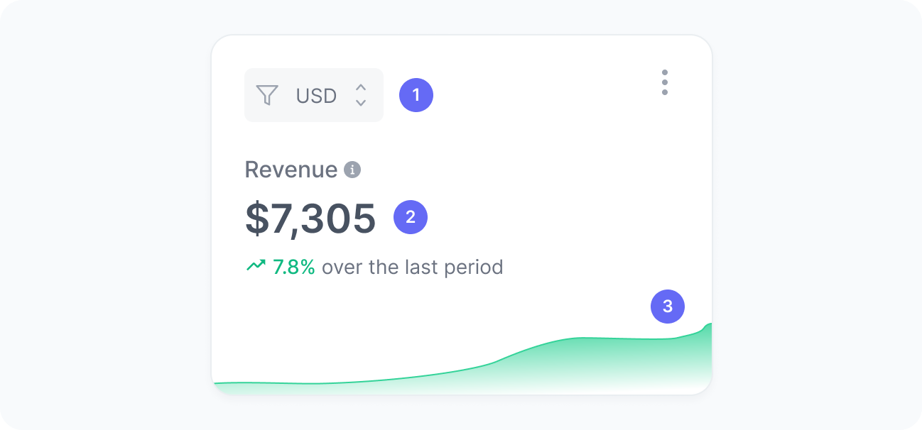
- Currency
A filter to select orders in a specific currency. Values are never aggregated across currencies. - Revenue
The total revenue from completed orders within the experience. - Revenue over time
A trend chart showing if revenue in your experience is going up or down.
Interpretation
This chart shows the revenue generated from orders in the selected currency, helping you assess the impact of your experience on sales. For example, if you introduced a targeted promotion through an experience, you can monitor whether revenue increased after its launch.
What the number tells you
Here are some common insights you can get from this widget:
- A rising revenue trend, such as an increase from $5,000 to $7,500 per day after launching the experience, suggests the experience positively influenced purchasing behavior. Consider analyzing which aspects of the experience drove this growth to replicate or enhance them.
- Stable revenue, for example, consistently around $5,000 per day before and after the experience launch, indicates the experience had no significant effect on sales. You might explore other experience goals, like boosting engagement or lead generation, or use this as a baseline for further optimization.
- A revenue decline, such as a drop from $5,000 to $3,500 per day, may signal that the experience is not connecting with users. Investigate potential causes, such as changes in product availability, pricing, or messaging.