Top products
Measure sales of your experience's top-selling products.
Track the Order placed event to feed data into this widget.
This widget displays the top 10 best-selling products during the selected period. It helps you identify which products generated the most interest and revenue among users impacted by your experience.
It is especially useful for connecting what is being personalized with what is actually selling, giving you insights into both performance and alignment between content and demand.
Metrics
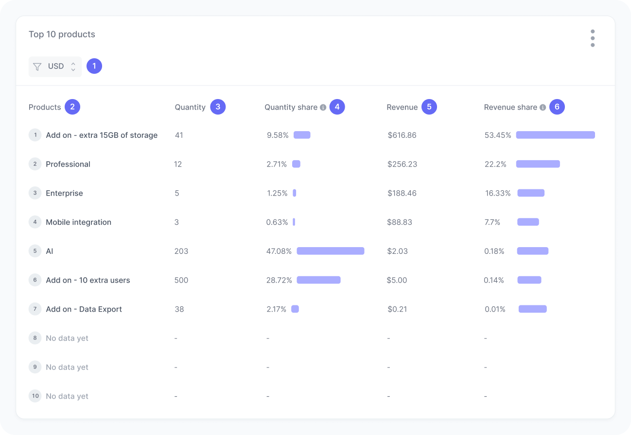
The chart includes:
- Currency
A filter to select orders in a specific currency. - Product
The name or identifier of the product. - Quantity
Total number of units sold. - Quantity share
The percentage of all units sold that this product represents. - Revenue
Total revenue generated by the product. - Revenue share
The percentage of total revenue that comes from this product.
Interpretation
Imagine this experience generated sales of 200 products in total, 30 of which were white T-shirts. In other words, 30 white T-shirts were sold, making up 15% of all units sold.
We calculate this metric using the formula:
Now consider revenue. If the 200 products together brought in $6,000, and each white T-shirt was priced at $25, then sales of the white T-shirts amounted to $750. That corresponds to 12.5% of the total revenue.
We calculate this metric using the formula:
What those numbers tell you
Here are some common insights you can get from this widget:
- If the white T-shirt sold 30 units, while the black hoodie sold only 10, you know the T-shirt had higher demand in this experience. This is useful for identifying your top-performing items in absolute volume.
- Even if the T-shirt sold 30 units, it’s important to analyze its share of total sales. For example, if those 30 units represent 15% of all products sold, this can show the T-shirt plays a significant role in the overall sales mix.
- A high-quantity product does not always mean high revenue. For instance, if the hoodie costs $100 each, those 10 units generated $1,000, while the 30 T-shirts at $25 each only generated $750. This highlights products that bring more financial return, even in smaller volumes.
- Looking at the hoodie’s 16.6% share of total revenue versus the T-shirt’s 12.5%, you can identify which products truly drive your revenue. This is key when analyzing profitability and prioritizing product promotions.
- If your experience highlights a specific product (e.g., the white T-shirt) and it ranks high in the Top 10, this suggests that experience positively influenced sales of that item. However, if sales of the white T-shirt remain low while other products appear in the ranking, it may indicate that this audience is not interested in the product or that your content strategy should be revisited.