Component
Learn how to organize your content into components.
Components are building blocks that you can combine in different ways to create different pages or sections.
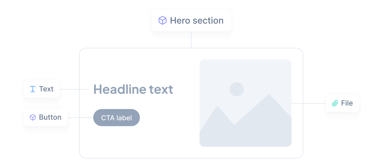
For example, a Hero section component might contain a headline, an image, and a call-to-action button, which might be a separate component.
You can mix and match components to define different content shapes — just like Lego pieces that can be combined in countless ways to create unique structures.
Types
There are two types of components you can choose from, depending on your needs:
- Regular component
Simple elements with a fixed structure and a fixed set of attributes. - Union component
Elements with variations, combining multiple regular components into one.
Schema
Once you have determined the type of component you need, the next step is to define its structure, or schema.
For regular components, it is a matter of defining the attributes that make up its structure. For union components, this means selecting the components you want to combine.
You can define a schema using the visual interface or uploading a schema file. The interface allows you to easily configure attributes in a few clicks, while the JSON file is perfect for those who prefer to work with code.
Attributes
Attributes are like placeholders in a template. They allow you to easily enter different types of information while maintaining a consistent structure across content.
Attributes can also include validation rules and user interface customization options. For example, you can specify if they are required or optional, set a maximum length for a text, or a minimum value for a number. You can even control the order in which they appear in the content editor for a more intuitive editing experience.
Versioning
As your application evolves, you may need to change your components. For example, you may want to add an attribute or change an existing one.
To avoid this problem, we have built a versioning system that allows you to seamlessly update your components without breaking your application.
This is a high-level overview of how it works:
You modify the component schema to make the desired changes.
We create a new version with the updated schema and keep the old version untouched.
While you adjust the content of affected slots or experiences, we continue to serve the old version to your application.
To assist you with the last step, we indicate the exact slots that require your review whenever you make a breaking change:
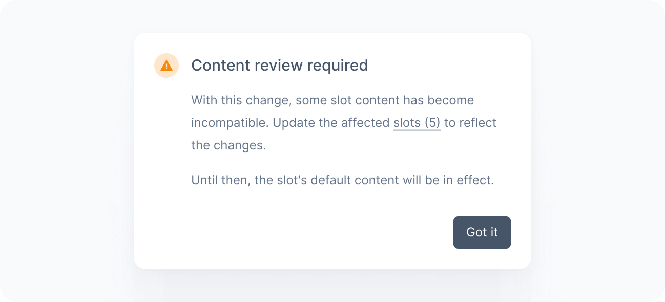
To learn more about how to update your slots, see Slot versioning.
Constraints
We enforce some limits on content schemas to ensure that components remain performant and manageable as your content model evolves.
A visual indicator in the component editor shows you how close your component is to reaching these limits:
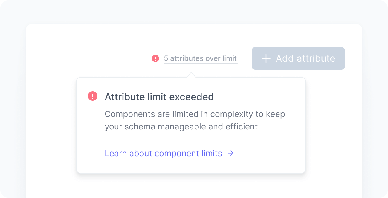
For more information about the limits that apply to components, see the constraints section in the Schema reference.