Revenue per user
Measure revenue contribution per user across your experiment.
Track the Order placed event to feed data into this widget.
Revenue per user (ARPU) measures the average revenue generated by a single user over a selected period.
This chart compares the average revenue per user across variants, helping you identify which version generates higher value, not just more orders.
Metrics
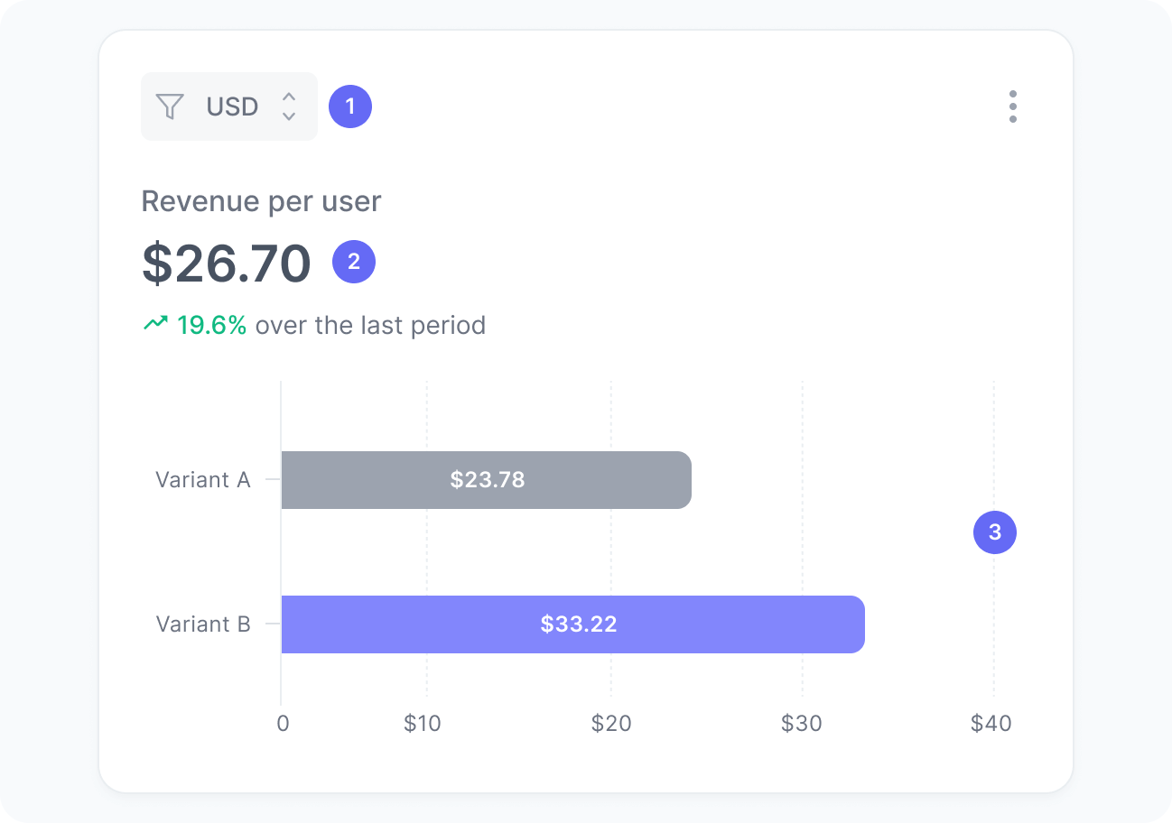
The chart includes:
- Currency
A filter to select orders in a specific currency. Values are never aggregated across currencies. - Revenue per user
The average amount of revenue generated by each user impacted by your experiment. - Revenue per user per variant
A breakdown showing the average revenue generated per user for each experiment variant.
Interpretation
This chart shows the average revenue per user, helping you assess how each variant of your experiment monetizes your traffic.
For example, if one variant generated $1,200 in revenue from 60 active users, the revenue per user is calculated as $1,200 ÷ 60 = $20. This means that, on average, each user exposed to that variant contributed $20 in revenue during the experiment.
We calculate this metric using the formula:
What the number tells you
Here are some common insights you can get from this widget:
- A higher revenue per user indicates that this variant not only drives conversions but also encourages users to spend more per purchase.
- A lower revenue per user may suggest lower order values or weaker upsell performance, even if conversion rates are stable.
- A stable revenue per user across variants shows that while the experience changes, user spending behavior remains consistent.
- Significant variation between variants reveals which version better balances acquisition and monetization, guiding future optimization efforts.