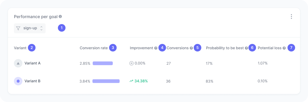
Performance per goal
Analyze how each variant performs for a specific goal in your experiment.
Track the Goal completed event to feed data into this widget.
This table compares the performance of all variants in your experiment for a selected goal, such as sign-ups, form submissions, or CTA clicks. It helps you assess which variant drives more conversions and understand the statistical confidence behind those results.
By monitoring these metrics, you can evaluate not only which variant converts more users toward those goals, but also the reliability and potential risks of choosing one version over another. This is a key component in determining when your experiment reaches statistical validity and which variant should be declared the winner.
Metrics
The chart includes:
- Goal filter
A filter to select the goal you want to analyze. - Variant
The name of each experiment variant. - Conversion rate
The percentage of sessions in which users completed the selected goal. - Improvement
The increase (or decrease) in conversion rate compared to the baseline variant. - Conversions
The number of sessions in which the selected goal was completed. - Probability to be best
The likelihood that this variant performs better than all others. - Potential loss
The expected missed gain if you choose this variant and it turns out not to be the best.
Interpretation
Imagine your experiment includes two variants: Variant A (your current version, also known as control or baseline) and Variant B (the new alternative). If Variant A has a conversion rate of 10% and Variant B has a conversion rate of 12%, Variant B shows a relative improvement of 20% over the baseline.
Probability of being best tells you how confident we are that Variant B truly performs better, not just by random chance. A 95% probability means there’s strong evidence that B genuinely outperforms A.
Potential loss answers a different question: “If I choose this variant and I’m wrong, how much could I lose?” In this example, a 2% potential loss for Variant A means that by sticking with A instead of switching to B, you could be missing out on up to 2 percentage points of conversions. Think of it as the cost of a missed opportunity. it is not that your conversions will drop, but rather that you might be leaving gains on the table.
What the number tells you
Here are some common insights you can get from this widget:
- Higher conversion rate and positive improvement indicate that a variant is performing better than the baseline.
- High probability of being best (PBB) indicates strong evidence that a variant is truly outperforming others. Many teams use 95% as the minimum threshold to declare a winner.
- Close PBB between variants indicates either more data is needed, or the change you are testing has no meaningful impact.
- Low potential loss indicates low risk in choosing a given variant. If you are wrong, you will not be leaving much on the table.
- High potential loss indicates choosing a given variant could mean missing out on significant gains if it turns out not to be the best. Consider waiting for more data before deciding.
- Stable values over time indicate your experiment is ready for a decision. Results become more reliable once each variant reaches a sufficient sample size (at least 1,000 visitors and 25 conversions).
- High PBB combined with low potential loss indicates you can confidently declare a winner.
How the metrics are calculated
Both metrics use Bayesian inference with a Beta distribution to model the uncertainty around each variant’s true conversion rate. Rather than treating the observed conversion rate as a fixed number, this approach acknowledges that the true rate could be higher or lower based on the data collected so far.
Modeling conversion rates
For each variant, the conversion rate is modeled as a Beta distribution:
Where:
- α (alpha) = number of conversions
- β (beta) = number of non-conversions (interactions − conversions)
This distribution represents all plausible values for the true conversion rate given the observed data. With more data, the distribution narrows, indicating greater certainty.
Probability to be best
The probability to be best is calculated through Monte Carlo simulation:
- For each simulation round, draw a random conversion rate from each variant’s Beta distribution
- Record which variant has the highest sampled rate
- Repeat thousands of times
- Calculate the proportion of simulations each variant won
This directly answers: “If the true conversion rates follow these distributions, how often would variant i be the best?”
Potential loss
Potential loss quantifies the downside risk of choosing a specific variant:
- For each simulation round, draw a random conversion rate from each variant’s Beta distribution
- For the variant being evaluated, find the difference between the highest competing rate and its own rate
- If the variant has the highest rate, the loss is zero
- Average these maximum differences across all simulations
Where:
- = number of simulations
- = sampled conversion rate for variant in simulation
This answers: “On average, how much better could the best alternative be compared to this variant?”